Friday, October 31, 2014

Photoshop and Illustrator Sphere Tutorials

The sphere is a universal symbol with numerous meanings. It is two vertical lines bent to form one complete circle. A sphere symbolizes totality, wholeness, originality, and infinity. 

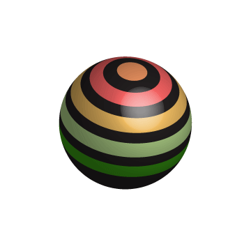
When I began this sphere project, I first practiced them in my sketchbook. After making the tutorials in both Illustrator and Photoshop, I saved the Illustrator file as a .ai and the Photoshop file  as a .psd. Overall, the tutorials in Illustrator were much easier. The Photoshop tutorials were completable, but they took a much longer time to complete. Also, in Illustrator I could change the color or shape of an object at any time. In Photoshop, I had to change the color or shape of the object in the beginning. In Illustrator, I could use less tools to complete the tutorial. In Photoshop, I had to use more tools to complete the tutorial.

I learned from the Photoshop tutorial how to use the smudge tool in order to give the sphere a fuzzy effect. I learned from the Illustrator tutorial how to create a glare on the sphere in order to make it more life like. 

I want to learn more about glares (light sources) and shadows in order to continue to make my creations life like. 

"A circle is never just a circle." ~Mrs. Lofquist

Links:
Illustrator:
http://pixelrockit.com/create-stylish-3d-shapes-with-adobe-illustrato  r/

Photoshop:
http://4-designer.com/2013/09/3-minutes-to-make-a-hairy-ball/#.VE5wCtykV4M


Thursday, October 23, 2014

Red Gradient Spheres

Photoshop and Illustrator are both Adobe programs, yet they are very different. Photoshop is a really good program to use when you are looking to edit photos. Hence the name, Photoshop. Illustrator has a lot of tools that help to add special details to your creations. You can illustrate and create unique products.


The first picture shown on the right is my red sphere from Photoshop. It is very grainy and almost has a textured look to it. The shadow added to the sphere is also not as life like as the shadow made in Illustrator. The light source (white dot) has a blurred effect to it. There also isn't much of a difference in the values of the colors.

My Illustrator sphere is much more life like. It also does not have the grainy or blurry textured look to it. The highlight on the red sphere looks as though there is a real light source shining on it. The values in the changes of the colors are also gradual and more accurate.

Saturday, October 4, 2014

Personal Logo


There are numerous ways that you can select the color, shape, and font, of your logo to tell your story using symbolism, psychology, and personality. You can choose warm or cool colors and hundreds of shapes, as well as fonts with various themes. My process went a lot like this: To  make my logo, I began with numerous sketches. After sketching, I went into Adobe Illustrator to create an artboard of my sketches. During our tutorial practices, I found one about making flowers. I remembered the steps of the tutorial that I had found earlier and was able to recreate it. I added reddish-pink colors and adjusted the opacity of all of the petals. I was really going for a simplistic look and I found that the flower really fit that desire. I learned how to use the direct crop tool (^) in order to make the petals pointy. I want to learn about more tools that can change the flower petal shapes in many different ways. I think I did a really good job picking out the colors of the flower and arranging them the way that I did. The only thing I would change would be the arrangement of the text on the flower. I want to make my name really pop and stand out. I need to work on picking out fonts that really fit the theme and emotion of the project that I am working on. Overall, I am really happy with how my logo turned out. It really represents me because I am simplistic, yet elegant. I love fun, bright colors, but in a sophisticated way.


Friday, October 3, 2014

Project 8 Website


This project was meant to teach us how to edit an image in Photoshop by adjusting the contrast, brightness, and texture of the picture, and then use it as a background  to make the text on our website easy to read. To begin with, we edited our pictures in Photoshop. We adjusted our skin tones. The pictures were taken with a white background so we had to prevent our pictures from looking washed out. Then we followed the outline of the picture to eliminate the excess space. 

After the picture was edited, we used an application called TextMate to design and create our website. For the background of our website, we used a "concrete" background image. Originally, this picture was very small and would show seams when it was enlarged. We edited it in Photoshop in order to make it seamless. I used Contrast, Alignment, Repetition, and Proximity (CARP) in the following ways: For contrast, I made my name a different color and font than the bulleted points. For Alignment, I put my name at the top of the page and had all of the bulleted points aligned to the left. Repetition was shown in the colors and alignment. As far as Proximity, my name was the biggest text on this page and the bulleted points are equally spaced out. 

The purpose of the wrapper div is to set the appropriate height and width of the page with text and images inside of it. This is shown by the red outline on my website. We included the CSS by creating a new style sheet. We linked this sheet to both our links and home page, so that the styles would apply to both.     

Throughout this project, I ran into problems with adding the images. I had to be really careful that I was typing in the correct name of the file, or else the image would not show. I think that I did a good job picking out attractive colors that go well together. I also think I did a good job editing my image in Photoshop. I would say that I still need to work on the Proximity portion of CARP. As shown in the photo above, there is a large gap of empty space between the last two bullet points. Next time, I will be more careful about the spacing on my website.